So.... on we go with gifts for a new baby.
Now we come to what I have added to mom's mix of goodies. And baby goodies are just so darned hard to resist! So I've had projects stashed, for a while now, just waiting for the right child to come along.
I love to crochet. Mom taught me when I was about 9 years old. I haven't done much of it over the years until recently. But when mom died, I started crocheting like a crazy woman, and I haven't stopped since. When I'm not feeling terribly creative, or I want something easy while I sit and watch tv and talk, or when I wake up in the morning with my coffee, crochet is it for me.
Before Zoe was even born, I'd spotted these booties. I just knew that someday I'd make them. They were done before she was even born! Of course, I rarely follow a pattern exactly. I made Zoe's booties two rows shorter, and in cotton rather than the wool. Zoe lives in Hawaii...
Then I got a bee up my butt and decided this Hawaii-born child needed an old-fashioned baby bonnet! In cotton, of course. So I found a cute free pattern on Ravelry.com, made some adjustments, and voila...
The next stop on gifts for a new baby will be..... Now you didn't really think I'd tell you... Did you? Stay tuned!
This blog is a journal of an artist's thoughts and endeavors, namely mine. I will frequently be writing about my art, my hand-crafted art cards in particular, but not always. I love nature, so I will also be talking about my yard and gardens, and the many birds that frequent my feeders. And sometimes I'll be sharing recipes and favorite shops and ......
Wednesday, June 4, 2014
Wednesday, May 28, 2014
Hand-crafted Gifts for a New Baby - Part 1
New babies. Crafters just love new babies, especially if they are in our own family! So many goodies to create for this new bundle of joy. And I now find myself in just this wonderful circumstance.


Our niece, the oldest in her generation, has just had a wonderful baby girl. Many of us were expecting a boy, so we're just thrilled! Our niece Cecily is the oldest child of the oldest child, and Cecily is also the oldest in her generation. And she has just given birth to the cutest baby girl, Zoe, who is now also the oldest in her generation. Did you follow all those oldests?
And of course, as a tried and tried true crafter and artist, dedicated to keeping the family crafts my mom taught me alive, I jumped on this happy circumstance! This baby just had to have the things my mom made for my boys, and more.
But I'm crossing family and cultural lines here. I was born and raised in the east coast. But my hubby's family is a Hawaii born and raised Chinese family. I'm melding the two. And after all, our country is a wonderful melting pot. So, I'm happily and creatively melting!

My mom made hundreds of Amish baby balls over the decades. Yes decades! They were always made from scraps of leftover cotton fabrics. My adult sons still have the ones she made for them, and they definitely treasure them. I knew I just couldn't let this tradition go with her passing. But the Amish baby ball I made for our niece's baby was done entirely in Hawaiian fabrics. Somehow, doing that baby ball in traditional quilter's cottons just seemed all wrong!
And then there were the receiving blankets, made from cotton flannel, with a hand-embroidered blanket stitch all around the edge. I still have the ones mom made for me to use with my boys.. And now our niece has ones I made for her. And I must admit, they look so cute with baby Zoe in them!
Our niece, the oldest in her generation, has just had a wonderful baby girl. Many of us were expecting a boy, so we're just thrilled! Our niece Cecily is the oldest child of the oldest child, and Cecily is also the oldest in her generation. And she has just given birth to the cutest baby girl, Zoe, who is now also the oldest in her generation. Did you follow all those oldests?
And of course, as a tried and tried true crafter and artist, dedicated to keeping the family crafts my mom taught me alive, I jumped on this happy circumstance! This baby just had to have the things my mom made for my boys, and more.
But I'm crossing family and cultural lines here. I was born and raised in the east coast. But my hubby's family is a Hawaii born and raised Chinese family. I'm melding the two. And after all, our country is a wonderful melting pot. So, I'm happily and creatively melting!

My mom made hundreds of Amish baby balls over the decades. Yes decades! They were always made from scraps of leftover cotton fabrics. My adult sons still have the ones she made for them, and they definitely treasure them. I knew I just couldn't let this tradition go with her passing. But the Amish baby ball I made for our niece's baby was done entirely in Hawaiian fabrics. Somehow, doing that baby ball in traditional quilter's cottons just seemed all wrong!
And then there were the receiving blankets, made from cotton flannel, with a hand-embroidered blanket stitch all around the edge. I still have the ones mom made for me to use with my boys.. And now our niece has ones I made for her. And I must admit, they look so cute with baby Zoe in them!
Stay tuned for the next part of this article. Our Zoe girl has me so excited to create girly things!
Thursday, October 31, 2013
A Kid's Mom (that is ... A Mom Kids Would Love To Have!)
The upcoming holidays have me in a blogging good spirit, so here we go! I have a few articles running around my brain for your reading amusement. But first, since it's Halloween time, I have to tell you about a friend/ business associate of mine. A little background on her first....
She's a mom and divorced, something many of us can relate to. She also has her own online business, a new life with a man she loves, who had to move the family because of his job. Oh, and there's an ex in there too. And.... she is a walking/talking medical mystery, which makes her day to day life rather challenging.
Now check out what she did for her little girl's Halloween week school wardrobe! Is this one lucky child or what? These outfits are so totally cool! And mom actually spent the time to make these cute skirt and tops, which doesn't really surprise me, I must admit. This child is almost always dressed in something totally awesome, made by her mom.


Are these just the cutest pumpkin and candy corn outfits you've ever seen? I sure think so! And these are just the warm up to the main event.....
Are you ready? I give you Snow White!
Is the a gorgeous costume or what? And totally handmade of course. I sew, and I used to make my boys Halloween costumes, many of which I've saved. But this Snow White costume really takes the cake from my point of view! Filmy netting, glittery sleeve insets.... All I can say is,"WOW!"
Now if you'd like to have a little of this talented mom's creativity for your special little girl, you're in luck! You can find Kim's fabulous, creative work at her online Etsy shop, The Joyful Princess Boutique at www.thejoyfulprinces.etsy.com. Kim is always creating wonderfully creative girly items for her daughter, so please go check out her shop!
Wednesday, August 7, 2013
Remembering Mom Through Cards
When my Mom passed away earlier this year, I knew that eventually all of the handcrafted cards I'd made for her over the years would come back to me. So I thought I would share a few of them with you.
I can honestly say, that my techniques really have improved over the last few years. At least I think so! And I also have to say that watching craft technique webisodes on Paperwishes.com has been a big part of my learning process. If you haven't checked out any of these videos yet, they are simply wonderful. Just don't watch them late at night, or your creative brain will be flooded with so many ideas you won't be sleeping any time soon.... Just believe me on that one!
Black glitter glue really does the trick here on this old-timey card. |
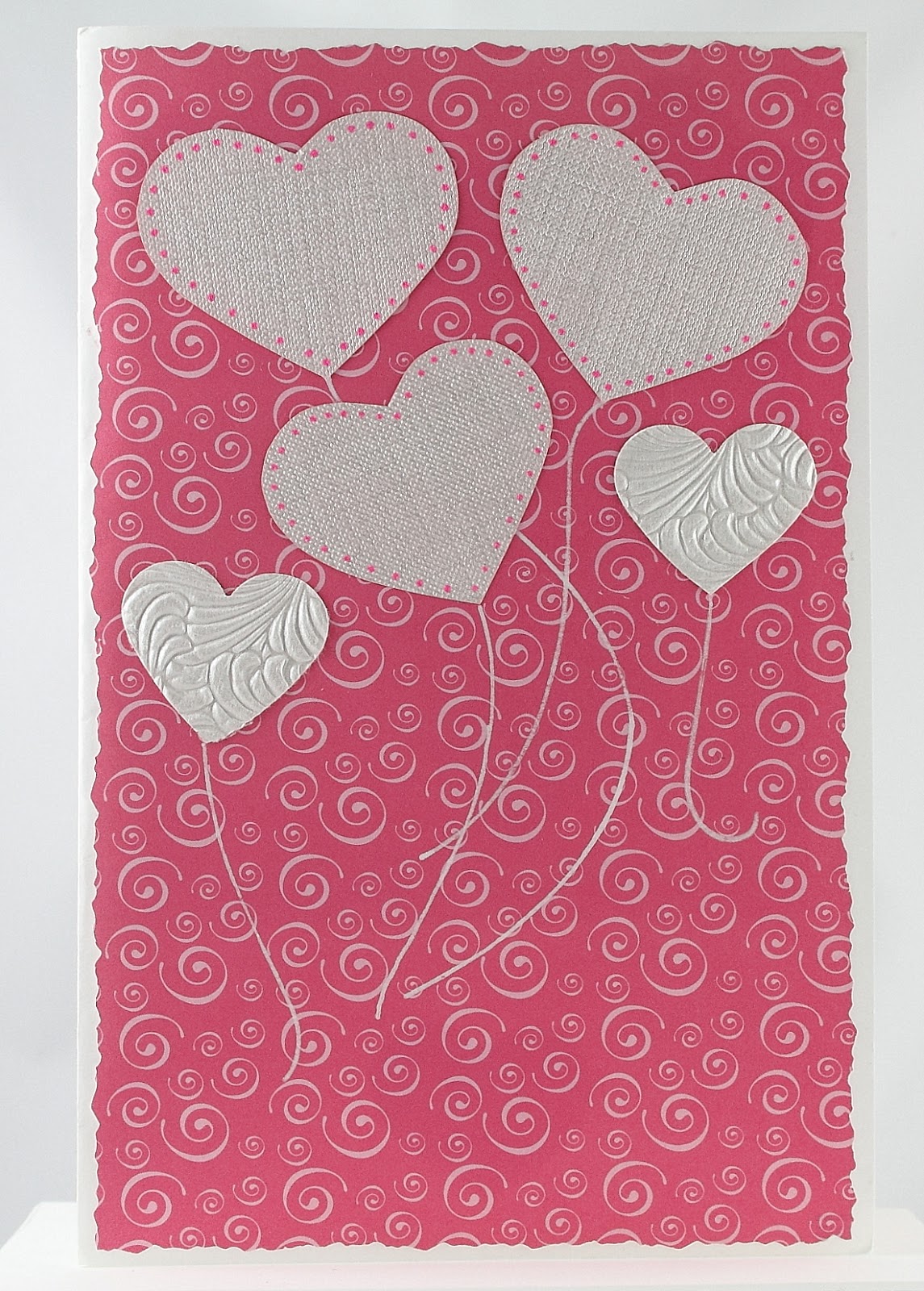
| I like turning hearts into ballooons |
Mom was an avid quilter, so I simply had to do a Sunbonnet Sue card for her. The first quilt she ever made me was a Sunbonnet Sue pattern. I was 6 years old, and I still have it. The technique I used for the front of the card is called Iris Folding. Directions and templates are easy to find on internet, but I made my own template for this project.
At one point in time I got heavily into paper quilling. I saw a pattern similar to this one in a book, I think, and had to try it out on a card.
And this fab paper is Color Me Resist paper available at Paperwishes.com. There are just scads of these papers available now, with the raised embossed portion in black, silver, gold, copper..... Big 12 x 12 inch sheets, card toppers, post cards... You can color on them with pastels, pencils, inks, paint.... This card was done with dye inks, carefully blending the colors. This whole line of Color Me Resist papers are just a ton of fun to play with! I was terrible at coloring as a child, so I'm going through that phase of my life as an adult!
Tuesday, July 30, 2013
Cute Chemo Caps
If you've ever spent any time hanging out with chemo patients, you know that they come up with a wide variety of head-covering options as they lose their hair and go bald. (As men have known for eons now, a bald head is a cold head in cool weather.) Lots of caps, but they all seem to scream 'winter hat being used to cover bald lady's head'! And scarves, they don't stay on bald heads too well. None of these options particularly thrilled me for my bff Margaret when her chemo treatments took out her hair!
Soooo, I set out on a mission to come up with some stylish hats that I could crochet for her. And the website www.ravelry.com was a perfect place to search. Many of their patterns are free. If you haven't been there and you love to knit or crochet, pop on over there when you get a chance.
First up were some wintery hats - a Queen of Sheba Turban in tan, and a black cap, both with added flower embellishments at Margaret's request.
Soooo, I set out on a mission to come up with some stylish hats that I could crochet for her. And the website www.ravelry.com was a perfect place to search. Many of their patterns are free. If you haven't been there and you love to knit or crochet, pop on over there when you get a chance.
First up were some wintery hats - a Queen of Sheba Turban in tan, and a black cap, both with added flower embellishments at Margaret's request.
Friday, July 19, 2013
What To Do With All Those Fabulous Wine Bottles and Beer Bottles
It's been a while folks, hasn't it? I'm still digesting the fact that my Mom is gone, at least physically, but I'm coping now. I've done a lot of crocheting in the interim, but that is a post (or three or four) for another time.
Right now I want to tell you what I do with all those wine bottles with beautiful artistic labels, that I can't seem to throw out. Have you really looked at the artwork that goes into the labels of some wines? Some are clean and sophisticated, others have come from original drawings and paintings. And recently, even beer bottles have made it into my collection!
I do a variety of things with these labels, but today I'm gonna talk about home decor. For real! Smaller wine bottles make really nice bud vases for a single stemmed rose. Especially those sweet dessert wines. They usually come in small bottles with really nicely-done artistic labels. Perfect for a bud vase.
And the first beer bottle in my collection is right in the middle of two little wine bottles. And I think that beer bottle matches the clock pretty darn well! And as it happens, it was brewed right down I-5 in Eugene. Overcast Espresso Stout by Oakshire Brewing. YUM! Who says you can't mix wine and beer?
And now my nod to the USA's July 4th holiday. Red, white and blue, huh? How am I gonna pull that off? With cats and flags! For real!
Originally these cool cats held reisling. And they actually have a 4th litter mate, a black dude that comes out for Chinese New Year. I drank my way through all 4 bottles just to make sure I had the complete set! And then I added little flags with some sort of sticky putty stuff and some bows at the neckline, and they're ready for the dining room table, or anywhere else you want to catch people's eye.
Stay tuned to my blog for more frequent articles on a wider variety of crafty issues!
Right now I want to tell you what I do with all those wine bottles with beautiful artistic labels, that I can't seem to throw out. Have you really looked at the artwork that goes into the labels of some wines? Some are clean and sophisticated, others have come from original drawings and paintings. And recently, even beer bottles have made it into my collection!
I do a variety of things with these labels, but today I'm gonna talk about home decor. For real! Smaller wine bottles make really nice bud vases for a single stemmed rose. Especially those sweet dessert wines. They usually come in small bottles with really nicely-done artistic labels. Perfect for a bud vase.
And the first beer bottle in my collection is right in the middle of two little wine bottles. And I think that beer bottle matches the clock pretty darn well! And as it happens, it was brewed right down I-5 in Eugene. Overcast Espresso Stout by Oakshire Brewing. YUM! Who says you can't mix wine and beer?
And now my nod to the USA's July 4th holiday. Red, white and blue, huh? How am I gonna pull that off? With cats and flags! For real!
Originally these cool cats held reisling. And they actually have a 4th litter mate, a black dude that comes out for Chinese New Year. I drank my way through all 4 bottles just to make sure I had the complete set! And then I added little flags with some sort of sticky putty stuff and some bows at the neckline, and they're ready for the dining room table, or anywhere else you want to catch people's eye.
Stay tuned to my blog for more frequent articles on a wider variety of crafty issues!
Labels:
art talk,
beer bottles,
crafting,
home decor,
wine bottles
Monday, March 25, 2013
An Unconventional Valentine
At long last, here is that Valentine I promised everyone ages ago!
I decided to be unconventional this year, so I ditched the traditional red and pink colors. I have a pack of beautiful card stock by Martha Stewart called the 'essentials paper pad'; 42 sheets of spectacular pale blues and greens, accented with loads of white lacy patterns and hearts, and even some super shiny paper too. I look through this pack of papers and just drool!
I kept the design relatively simple because the papers are just sooooo pretty. First I punched the lacy edge of the paper, and then folded the card stock in half. I wanted to make sure that the lacy edge exactly met that back edge. So you cut first and fold second. The three hearts I cut out from a page so I could use them down the middle, vertically, overlapping, instead of the way they were printed, which was horizontally and not touching. Wrong direction! I then added a couple bows and put those sparkle dots in the middle just for a bit of added glitz. And we all know how much I love to use a bit of bling! Next came the birds, out of a shiny green paper, just for a bit more pizazz.
For the inside, I kept the heart theme going and used the same lacy background paper as well. And I added another bow with a sparkly dot being flown up into place by two more birds. The sentiment is simple, on purpose. "I love you!" really seemed to be enough. The overlapping heart stickers are beautifully embossed, and probably from the wedding section, if I recall correctly.
Unfortunately, my Mom never got to see this card. She passed away shortly before Valentine's Day. This is the hardest blog post I've ever had to do. Mom was a card crafter decades before it was even popular. And it is so hard to think that my days of crafting something beautiful for her are gone. Fortunately, I am surrounded by her beautiful artwork all over my house. And she will be close to me in my heart always....
Thursday, February 7, 2013
Birthday Card for Mom
My mom was 94 years old in late 2012. And her birthday always means a very special art card from me. Now my Mom is a very talented, creative, artistic person in her own right, and she was making handcrafted cards decades before it was even popular! And it is sharing our artistic talents that has made us so very close over my adult years.
My Mom loves muted colors, and I was in a mood to play with my new fern template from Paperwishes. And then I just started rooting through nearly everything I have in my cardmaking arsenal. I can sit and look at papers and consider various combinations for hours and days! The paper I used for the ferns is actually a piece of cold-pressed water color paper. I wanted lots of texture. Then I started the inking process. First I did the the entire piece of paper in a pale, pale yellow-green. Then the ferns, beginning with the lightest greens, and gradually getting darker, until I got the look I wanted. And if I remember correctly, I used my Spectrum Noir pens to give them a soft look. If you've never played around with these alcohol pens, you should give them a try! The way the colors blend is almost magical.
Tearing this watercolor paper gives a nice aged-looking edge. To get this look, I tore the excess paper toward me, so a bit of the topmost layers were torn away with the excess. If you tear your paper the other way, you get a completely different look. Try it!
Then I just started layering papers and adding embellishments. The tag on the left, above, was made using the Layered Labels template by Hot Off The Press (available at Paperwishes). And I'm really loving this template, and using the heck out of it! This template has 9 different styles of labels. All you have to do is pick your style, pick your papers, trace and cut. Add some embellishments, and voila!
And as my Mom would say, "There you have it."
Next week I will post the Valentine's Day card I just finshed for Mom. It's just a wee.... bit different than most Valentine's Day cards.
Happy crafting!
Tuesday, October 9, 2012
The Making of an Art Card - Part 3
There came a day when I just knew that the captain of my Etsy team, 'It's A Madcap Life', needed a little surprise lift via the postal elephant, as I like to call our US Postal Service. So I set my creative wheels in motion to make her an art card. And it wasn't long before I had a plan...
So... my plan was to turn the card into a little shop called the Madcap Heiress.
But first, a little background. A'esha, our beloved captain, has an Etsy shop (duh!) called The Madcap Heiress, where she sells jewelry inspired by iconic beautiful women, and fashion look books. She is a tour de force when it comes to dressing women fashionably. And when I have a fashion question, I throw it over to her.
So... my plan was to turn the card into a little shop called the Madcap Heiress.
Now obviously, the front of the card needed to be the outside of the shop. So I dug through my templates until I found a template called Basic Wallpaper from www.fairytalecreations.com, that I use to create brick exteriors. And with a variety of brownish chalks and cotton balls, I chalked in the brick on the front of the card. Then, using their Chalk Talk 2 template, I created the front door, on a separate piece of cardstock, with yellow chalks. A sparkly dot for a door knob, a rose sticker above the door window and an open sign completed the front door.
Then it was on to the sign. For this I dug out a fabulous tag template called 15 Lovely Labels from Hot Off The Press, available at www.paperwishes.com . I love this template! I use it all the time to make wonderful layered tags and labels. And voila! A sign for the shop.
Then the inside. I knew I had these little paper packs of embellishments called Pretty by Artsy Collage. And I've looked at them enough over the years that I also knew that they had exactly the items I was looking for to put in this shop, beautiful Victorian era fashion items. So I carefully cut them all out.
Every single item inside the shop came from that pack, even the beautiful quote, and the decorative umbrella left by a customer outside the shop. I did add some aluminum foil to the picture frame to change it into a mirror. I even had the cork paper for the walls behind the shelves! And by angling the shelves, instead of cutting them in a rectanglular shape, the perspective is much better and looks much more realistic.
I must admit, I think this was the easiest and quickest art card I've ever made!
Tuesday, September 25, 2012
Detour!
I had planned something altogether different for this post, and then my hubby cooked dinner and changed all my plans...
So it's fall. The weather here has gone from 90 on Monday, which is 15 degrees above average, to 65 today, Friday, which is 10 degrees below average. These huge temperature swings really muck with my equanimity. Ya know! Not to mention I have to dig through closets for warm clothes, when I was wearing tank tops and shorts a couple days ago! But I digress. Oops...
We have a neighbor with a Japanese pear-apple tree. And each year at this time, we are fortunate enough to get some of the fruit from their tree. And tonight my hubby came up with an Asian-inspired rendition of the traditional American sauteed apples sidedish. And it was really good!
So you slice up some Asian pear-apples, just like apples for a pie or tart. Then you toss them into a saute pan with some Ponzu Citrus Seasoning Sauce, Mirin Sweet Cooking Seasoning(sweet seasoned rice wine) and a bit of sugar. Let it all simmer for a bit and serve while the fruit is still crispy tender. And that's it folks!
Serve with a stir fry and rice, as a slightly sweet fall sidedish, borrowed from the west. And there you go. East meets west, just like my marriage!
But wait, I have an idea! Thicken the sauce with arrowroot. Toss it with the sliced pear apples to mix well, and then into a partially pre-baked buttery pie crust and bake for a bit...
Thursday, September 6, 2012
The Making of a Doll Bed
OK, so is this doll bed cute or what? It was a special birthday present for a special little girl's 5th birthday recently. We made it from a little 'Cuties orange' box, paint stirrer sticks, and leftover fabric. The only thing I bought was some acrylic paint in lavender, pink, and white. And I still have a ton of leftover paint! Now I wish I could take credit for this idea, but alas, the idea came from a Martha Stewart show. I'll post a link at the bottom of this article.
So the first thing I did was score a Cuties orange box from my bff who was on the lookout for one for me. She darn near tackled a produce guy for it! Then I had my hubby get me some paint stirrer sticks, which you can get for free from paint departments in those monster-sized home improvement stores. And then I had my hubby prime the box and paint stirrer sticks.
So far this project is working out ok for me, huh? I then glued a couple paint stirrer sticks to the primed base at the head and foot of the bed, using wood glue. This provides a good stable base for gluing the headboard and footboard to the bed. And since this part of the bed will never show, you don't have to worry about color here.
The only thing I would have done differently is to prime the bed frame white, since we ended up painting the it white in the end. Covering the gray primer took a few coats of acrylic paint! Oh, and I'd probably try using spray paint next time too. It would go much quicker I think.
And while I was coating these puppies with white paint, and waiting for the paint to dry, I started on a simple reversible quilt with matching pillow, and a dust ruffle. The girl's favorite colors are pink and purple, so pink and purple it was!
Now, since I had two different sizes of paint stirrer sticks, I chose to place the large ones in the four corners, and have them raised up high enough to make a canopy (And fyi, Martha didn't have a canopy!) for this deluxe doll bed. I chose to skip the whole mattress part, but Martha did make a nice covered mattress in her version. And all of the bedding is washable. You just pull it off the bed and throw it into the machine!
Then the little girl's mom thought some stencils in pink and purple would be really cute on the headboard and footboard. So I dug out my stencils for her, we taped the headboard and footboard together with painter's tape, I poured us each a glass of wine, and I said, "Go for it!" And she did. And it was very cute! Don't ya think?
Then we glued the headboard and footboard to the base of the bed with a lot of wood glue. I even put a heavy book on there while it was drying, just to make sure it never comes apart.
Then all I had to do was create a canopy that matched the dust ruffle. I narrow hemmed a rectangle, added eyelet trim to the edges, and ribbon ties at the corners to attach it to the bed posts.
And there you have it. A really cute doll bed which actually just barely fits a Barbie. And it really was a fun project to do with a friend, for her daughter's 5th birthday.
Monday, August 13, 2012
Belated Birthday
While enjoying a glass of wine (or two!) with a friend one afternoon, she exclaimed, "Oh shit! I forgot my mother's birthday yesterday... Do you mind if I give her a quick call?" I of course said I didn't mind at all. And when she was done, I offered to make her a special Belated Birthday card, for a price! And she took me up on it, so here is what I did.
First, I decided to make a tri-fold card this time. I haven't done one in a while, and I would just hate to be stuck in a creative rut! To do this, I used this nifty template gizmo called a Top Score multiboard by Crafter's Companion. This scoring board can be used to make all kinds of creative card shapes, and it comes with really good instructions too. I bought mine online at Paper Wishes. Oh surprise!
I knew I was after a card in reds, because I asked my friend what her mother's favorite color is. She actually had to call her! So I started digging through my extraordinarily organized stash of papers (We have a small house and I have a large stash!), and I honed in on this stripey rose pattern and a solid red to match.
Then I followed the directions on the Top Score to create the shell of the card from a heavy white card stock. Next, red paper went on the front side. On the back side in the middle, I cut out a piece of the stripey rose pattern for the top, because it shows, so I want that to be pretty too. But I don't want it all matchey matchey, if you know what I mean. And for underneath that I found a pretty little sticker of a perfume bottle in pink to pop onto the bottom.
Then it was on to the inside. First, a couple more cutouts from that stripey rose pattern. Then I picked out the sentiment, which we didn't want all gushy, so I kept it very basic. In cases like this, I really want the rest of the card to be very creative and artistic. In fact, I prefer it that way. It's just my style and personality. I like to express myself with my time and my artwork. And each artcard is unique, created especially for that particular person.
Various stickers and some border punching around the sentiment completed the card. And then, since I knew it wouldn't be mailed, I took a sheet of the stripey rose paper and made an envelope. I used another neat gizmo called The Enveloper, also by Crafter's Companion, and also available online at Paper Wishes.
And there you have it, another artcard. Next time I'm going to change direction. It's not going to be an artcard!
First, I decided to make a tri-fold card this time. I haven't done one in a while, and I would just hate to be stuck in a creative rut! To do this, I used this nifty template gizmo called a Top Score multiboard by Crafter's Companion. This scoring board can be used to make all kinds of creative card shapes, and it comes with really good instructions too. I bought mine online at Paper Wishes. Oh surprise!
I knew I was after a card in reds, because I asked my friend what her mother's favorite color is. She actually had to call her! So I started digging through my extraordinarily organized stash of papers (We have a small house and I have a large stash!), and I honed in on this stripey rose pattern and a solid red to match.
Then I followed the directions on the Top Score to create the shell of the card from a heavy white card stock. Next, red paper went on the front side. On the back side in the middle, I cut out a piece of the stripey rose pattern for the top, because it shows, so I want that to be pretty too. But I don't want it all matchey matchey, if you know what I mean. And for underneath that I found a pretty little sticker of a perfume bottle in pink to pop onto the bottom.
Then it was on to the inside. First, a couple more cutouts from that stripey rose pattern. Then I picked out the sentiment, which we didn't want all gushy, so I kept it very basic. In cases like this, I really want the rest of the card to be very creative and artistic. In fact, I prefer it that way. It's just my style and personality. I like to express myself with my time and my artwork. And each artcard is unique, created especially for that particular person.
Various stickers and some border punching around the sentiment completed the card. And then, since I knew it wouldn't be mailed, I took a sheet of the stripey rose paper and made an envelope. I used another neat gizmo called The Enveloper, also by Crafter's Companion, and also available online at Paper Wishes.
And there you have it, another artcard. Next time I'm going to change direction. It's not going to be an artcard!
Saturday, July 7, 2012
Thursday, June 21, 2012
40th Birthday Card -Time To Have Some Fun!
While talking with a friend at our boys' lacrosse game this past season, she happened to mention that her brother was going to be forty soon. Now, I know her brother because he comes to a lot of the lacrosse games. And the two are very close, and delight in picking on and teasing each other. So I jumped at the 40th birthday opportunity and offered to make a card. Time to play and have some fun!
So I decided the card had to be very masculine, he's a very big dude. And the card also had to be kind of on the mean side, just for fun! And this is how it began.
I used this great shiny black snakeskin paper for the background, and did the bell out a swirly silver paper. I used my Sakura glaze pens to do a gray outline on the bell and then decided to add the crack in there too, just like the Liberty Bell in Philadelphia, which is where I'm from originally. I already had the phrase in mind, so I played around with fonts and sizing in my Broderbund Print Shop program, which I really use the heck out of. The edges of the phrases were cut with deckle edge scissors and then I carefully inked the edges black. And I also grabbed a Sakura glaze pen in black and accented the first letter of both phrases.
Then it was on to the inside.
I started with the black and silver papers that I used on the card front. And then I decided to add the little pop up. I used the same font as the front and accented the capital Ls with my favorite black Sakura glaze pen. The 40! is a cardboard punch out that I glitter-glued with red Stickles. I used a different font for the happy birthday tag, because I thought enough is enough on the old-style gothic font, and I inked the edges of the tag in red.
Then it occurred to me that some black balloons wafting up through the pop-up would be fun. So I found my balloon template and used plain black paper, then added red embroidery floss for the balloon strings.
And big sister had childhood photos that I was able to scan and print, to complete the card. And I must admit, I had a lot of fun making this card!
So I decided the card had to be very masculine, he's a very big dude. And the card also had to be kind of on the mean side, just for fun! And this is how it began.
I used this great shiny black snakeskin paper for the background, and did the bell out a swirly silver paper. I used my Sakura glaze pens to do a gray outline on the bell and then decided to add the crack in there too, just like the Liberty Bell in Philadelphia, which is where I'm from originally. I already had the phrase in mind, so I played around with fonts and sizing in my Broderbund Print Shop program, which I really use the heck out of. The edges of the phrases were cut with deckle edge scissors and then I carefully inked the edges black. And I also grabbed a Sakura glaze pen in black and accented the first letter of both phrases.
Then it was on to the inside.
I started with the black and silver papers that I used on the card front. And then I decided to add the little pop up. I used the same font as the front and accented the capital Ls with my favorite black Sakura glaze pen. The 40! is a cardboard punch out that I glitter-glued with red Stickles. I used a different font for the happy birthday tag, because I thought enough is enough on the old-style gothic font, and I inked the edges of the tag in red.
Then it occurred to me that some black balloons wafting up through the pop-up would be fun. So I found my balloon template and used plain black paper, then added red embroidery floss for the balloon strings.
And big sister had childhood photos that I was able to scan and print, to complete the card. And I must admit, I had a lot of fun making this card!
Wednesday, June 6, 2012
A Tale of Two Cards
I recently had the opportunity to create two 'thinking of you' cards, so I decided to craft them at the same time, using the same group of papers. They are similar on the outside, but the insides were customized for the inidivual person receiving the card.
So I dug through my stash of papers, which continues to grow, and decided on soft colors. I have so much paper and so many crafting tools now that I sometimes forget what I have!


So I dug through my stash of papers, which continues to grow, and decided on soft colors. I have so much paper and so many crafting tools now that I sometimes forget what I have!
The fancy tags on the front I made with my favorite new tag-making template (from www.paperwishes.com) that I got for Mother's Day from my #2 son. I just love this template! It has several different tags on it, all with different styles, all with those great layers built right in, which makes it super easy to create really pro-looking tags that perfectly match your project. I'm just looking for ways to use this template these days, and there's another one now, which I don't have, yet....
At this point I sat and looked at the cards for a while, and decided that flowers were in order. So I dug through my paper stash again, this time my scrap stash, to find matching solid colors. And then I dug through my bin of punches to find my various different flower punches and little circle punches. And I created the flowers, layering smaller flowers inside bigger ones, and punching out flowers around flowers on the paper, and adding itty bitty circles in the middle of some. Then I played around with the flowers on the page until I was happy, and added a bit of lace down the left side.
Then on to the insides, which were very different.
For the insides I looked at my collection of sentiments and matching embellishments and I was lucky enough to find things that I liked and that matched my choice of papers. Oh yeah! I love it when I have exactly what I want! I then added the hearts, which I punched out myself from matching papers, and created the 'thinking of you' tags. Deckle edge scissors and ink fancied up the edges of the papers for a more decorative look. And then they were off, the old-fashioned way, via snail mail.
Tuesday, May 29, 2012
Birthday Card for my hubby
The cards I make for my husband each year are ones that I really sweat over! I want them to be perfect because I know that he really treasures the time and creative energy that I put into them. They frequently have an oriental theme, because he's Chinese. And I really do love working with oriental papers and embellishments, and then combining them with more traditional papers and elements. I'm very contemporary traditional!
So here is this year's birthday card. And it really does combine the oriental and traditional. I went out on a limb with the metallic copper paper, because he is not a big fan of browns, but I love it, so I went with it.
I picked three background papers from 'the Natural Stack' by Die Cuts With a View (DCWV). I have quite a few different 'stacks' by DCWV because they make high quality papers and I just really love the papers they put out. Then I added some copper sticker stripes along the borders of the papers so the transition from paper type to paper type didn't look so odd. The copper stripes are kind of like those transitional strips between carpet and hard flooring in your house! And all of these beautiful copper foil papers were really just a background for the tiger scene I got from the "Japanese Design" book and cd from DoverPictura. I printed out the tiger and then mounted it on the paper I used for the skinny stripe, which is very subdued. And for a little more bling, I added some orange crystals in the corners.
So here is this year's birthday card. And it really does combine the oriental and traditional. I went out on a limb with the metallic copper paper, because he is not a big fan of browns, but I love it, so I went with it.
I picked three background papers from 'the Natural Stack' by Die Cuts With a View (DCWV). I have quite a few different 'stacks' by DCWV because they make high quality papers and I just really love the papers they put out. Then I added some copper sticker stripes along the borders of the papers so the transition from paper type to paper type didn't look so odd. The copper stripes are kind of like those transitional strips between carpet and hard flooring in your house! And all of these beautiful copper foil papers were really just a background for the tiger scene I got from the "Japanese Design" book and cd from DoverPictura. I printed out the tiger and then mounted it on the paper I used for the skinny stripe, which is very subdued. And for a little more bling, I added some orange crystals in the corners.
Then for the inside. I used two of the three background papers from the front as backgrounds for the bamboo, round grasses and sentiment. The bamboo and round grasses were done with metal templates that I have. For color I used a variety of green inks, starting with the lightest colors and ending with the darkest colors.
The sentiments I found in my stash somewhere, but I didn't like the paper or font that had been used. And I wanted to combine a couple sentiments. So I went to my trusty Print Shop Pro program from Broderbund and created my own sentiment with exactly the fonts I wanted, the size and shape I wanted and on the paper I wanted. And I must confess, I do this a lot. I'm really starting to play around with mixing fonts, bolding certain words, and layering words over top of each other. I use the heck out of that program! And I do occasionally update to a newer version because I like it so much.
Then it was time for a few last embellishments. The copper hexagons I cut out one by one from background paper. Honest! The orange bamboo stickers I took out of my stash. And just so folks would know, including my hubby, that bamboo is a sign of vitality, I included then little 'vitality' sticker too.
And voila! There you have it.
Thursday, May 17, 2012
Lilac 'Miss Kim' Photos
These are three photos I took yesterday morning of our 'Miss Kim' Lilac. It is having its first really spectacular bloom since we planted it a few years ago. Which photo do you like best? Let me know! They will all be up for sale on my Etsy shop www.andreagoo.esty.com very soon.
Thursday, May 3, 2012
Happy Birthday - for a musical guy
OK, well I'm still on my Color Me Resist paper kick! This time the card is for my oldest son, who will be 28 years old on May 2nd. And exactly how did he get so old?
My son eats, sleeps and breathes music, and he has since he was 4 years old. So I chose to use a 12x12 inch sheet of the musical notes Color Me Resist paper. I colored the whole sheet first, and then decided how to cut it up and use it. I wanted an old world feel to the paper, so I chose golds, browns and a bit of green too, layering the ink colors over each other until I felt that it looked the way I wanted it to. And since the paper has this wonderful flourish detail in the bottom right corner, I chose to use that part for the front of the card. Then I colored a matching tag in greens, for a little contrast, and added a Happy Birthday vellum sticker from my stash. Next I added a few rusty-colored dots with those Sakura Glaze Pens that I love so much, for a pop of color, and a matching dot-thing sticker-thing on the tag. And this is how the front of the card looks now that it is completed. The paper is so wonderful, I really felt like anything more would be too much.
Next it was on to the inside. I started with another big chunk of the music notes paper on the right side. Then I found some sentiments that I liked for a birthday card for a young musical guy, nothing too mushy! And I added some music note stickers that I had in my stash.
And I thought I was done! So I showed it to my hubby who said, "What are you going to put on the other side?" Everyone is so used to me covering the whole bloody card with artwork, I can't skimp anywhere anymore! So I thought about it for awhile. I didn't want to detract from what I had already done. And then it hit me! More music notes, cut out of the music notes paper. And then it was done....
Tuesday, April 3, 2012
Thinking of You
Inevitably there are occasions throughout the year when I find myself making cards for unexpected events. Unfortunately, these are not usually happy events. They are what I like to call 'Thinking of You' events. I'm not one for mushy sentiments, just some good old creativity in the form of an art card and a simple thought. I like to let my art do the speaking.
A friend of mine recently shared some disheartening news about her husband's health, and it was just the time for one of these cards.
To finish off the front I added some simple ribbon stripes, the tag accented with dots of my favorite glaze markers and a bow.
On the inside I used peachy vellum, with more simple ribbon stripes. I printed the tag from an art program of mine and used a Martha Stewart border punch to create its decorative edge, and a few more dots with my favorite glaze markers. And by now you probably know that the butterfly is also a Martha Stewart punch accented with her glitter. Good guess!
And voila! Off in the mail it went.
A friend of mine recently shared some disheartening news about her husband's health, and it was just the time for one of these cards.
I started this project with another pattern of the Color Me Resist paper from Paper Wishes ; they have so many beautiful options now. And since acquiring a whole lot of Spectrum Noir markers, also available from Paper Wishes , I was anxious to try them out on this paper and see if they were as magical as they seemed they might be. They worked like a charm! The markers blend so beautifully, and there are sets of colors in various shades and hues of the same color that really make blending a cinch! You need to work with the Spectrum Noir markers while they are still wet, otherwise they don't blend the same way, which is why the outline of the leaves is a bit pronounced and unblended. Of course, my friend didn't know that until now!
To finish off the front I added some simple ribbon stripes, the tag accented with dots of my favorite glaze markers and a bow.
On the inside I used peachy vellum, with more simple ribbon stripes. I printed the tag from an art program of mine and used a Martha Stewart border punch to create its decorative edge, and a few more dots with my favorite glaze markers. And by now you probably know that the butterfly is also a Martha Stewart punch accented with her glitter. Good guess!
And voila! Off in the mail it went.
Subscribe to:
Posts (Atom)