Showing posts with label card crafting. Show all posts

Wednesday, August 7, 2013

Remembering Mom Through Cards

 
When my Mom passed away earlier this year, I knew that eventually all of the handcrafted cards I'd made for her over the years would come back to me. So I thought I would share a few of them with you.
 
I can honestly say, that my techniques really have improved over the last few years. At least I think so! And I also have to say that watching craft technique webisodes on Paperwishes.com has been a big part of my learning process. If you haven't checked out any of these videos yet, they are simply wonderful. Just don't watch them late at night, or your creative brain will be flooded with so many ideas you won't be sleeping any time soon.... Just believe me on that one!


Black glitter glue really
does the trick here
on this old-timey card.


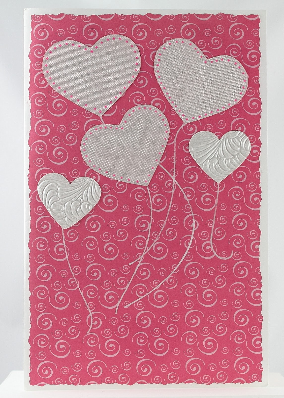
I like turning hearts
into ballooons


Mom was an avid quilter, so I simply had to do a Sunbonnet Sue card for her. The first quilt she ever made me was a Sunbonnet Sue pattern. I was 6 years old, and I still have it. The technique I used for the front of the card is called Iris Folding. Directions and templates are easy to find on internet, but I made my own template for this project. 


At one point in time I got heavily into paper quilling. I saw a pattern similar to this one in a book, I think, and had to try it out on a card.


And this fab paper is Color Me Resist paper available at Paperwishes.com. There are just scads of these papers available now, with the raised embossed portion in black, silver, gold, copper..... Big 12 x 12 inch sheets, card toppers, post cards... You can color on them with pastels, pencils, inks, paint.... This card was done with dye inks, carefully blending the colors. This whole line of Color Me Resist papers are just a ton of fun to play with! I was terrible at coloring as a child, so I'm going through that phase of my life as an adult!


Monday, March 25, 2013

An Unconventional Valentine


At long last, here is that Valentine I promised everyone ages ago!


I decided to be unconventional this year, so I ditched the traditional red and pink colors. I have a pack of beautiful card stock by Martha Stewart called the 'essentials paper pad'; 42 sheets of spectacular pale blues and greens, accented with loads of white lacy patterns and hearts, and even some super shiny paper too. I look through this pack of papers and just drool!


I kept the design relatively simple because the papers are just sooooo pretty. First I punched the lacy edge of the paper, and then folded the card stock in half. I wanted to make sure that the lacy edge exactly met that back edge. So you cut first and fold second. The three hearts I cut out from a page so I could use them down the middle, vertically, overlapping, instead of the way they were printed, which was horizontally and not touching. Wrong direction! I then added a couple bows and put those sparkle dots in the middle just for a bit of added glitz. And we all know how much I love to use a bit of bling! Next came the birds, out of a shiny green paper, just for a bit more pizazz.


For the inside, I kept the heart theme going and used the same lacy background paper as well. And I added another bow with a sparkly dot being flown up into place by two more birds. The sentiment is simple, on purpose. "I love you!" really seemed to be enough. The overlapping heart stickers are beautifully embossed, and probably from the wedding section, if I recall correctly.
 
Unfortunately, my Mom never got to see this card. She passed away shortly before Valentine's Day. This is the hardest blog post I've ever had to do. Mom was a card crafter decades before it was even popular. And it is so hard to think that my days of crafting something beautiful for her are gone. Fortunately, I am surrounded by her beautiful artwork all over my house. And she will be close to me in my heart always....


Tuesday, October 9, 2012

The Making of an Art Card - Part 3

There came a day when I just knew that the captain of my Etsy team, 'It's A Madcap Life', needed a little surprise lift via the postal elephant, as I like to call our US Postal Service. So I set my creative wheels in motion to make her an art card. And it wasn't long before I had a plan...

But first, a little background. A'esha, our beloved captain, has an Etsy shop (duh!) called The Madcap Heiress, where she sells jewelry inspired by iconic beautiful women, and fashion look books. She is a tour de force when it comes to dressing women fashionably. And when I have a fashion question, I throw it over to her.

So... my plan was to turn the card into a little shop called the Madcap Heiress.


Now obviously, the front of the card needed to be the outside of the shop.  So I dug through my templates until I found a template called Basic Wallpaper from www.fairytalecreations.com, that I use to create brick exteriors. And with a variety of brownish chalks and cotton balls, I chalked in the brick on the front of the card. Then, using their Chalk Talk 2 template, I created the front door, on a separate piece of cardstock, with yellow chalks. A sparkly dot for a door knob, a rose sticker above the door window and an open sign completed the front door.
 
Then it was on to the sign. For this I dug out a fabulous tag template called 15 Lovely Labels from Hot Off The Press, available at www.paperwishes.com . I love this template! I use it all the time to make wonderful layered tags and labels. And voila! A sign for the shop.
 
Then the inside. I knew I had these little paper packs of embellishments called Pretty by Artsy Collage. And I've looked at them enough over the years that I also knew that they had exactly the items I was looking for to put in this shop, beautiful Victorian era fashion items. So I carefully cut them all out.


Every single item inside the shop came from that pack, even the beautiful quote, and the decorative umbrella left by a customer outside the shop. I did add some aluminum foil to the picture frame to change it into a mirror. I even had the cork paper for the walls behind the shelves! And by angling the shelves, instead of cutting them in a rectanglular shape, the perspective is much better and looks much more realistic.
 
 
I must admit, I think this was the easiest and quickest art card I've ever made!  


Wednesday, June 6, 2012

A Tale of Two Cards

I recently had the opportunity to create two 'thinking of you' cards, so I decided to craft them at the same time, using the same group of papers. They are similar on the outside, but the insides were customized for the inidivual person receiving the card.

So I dug through my stash of papers, which continues to grow, and decided on soft colors.  I have so much paper and so many crafting tools now that I sometimes forget what I have!


The fancy tags on the front I made with my favorite new tag-making template (from www.paperwishes.com) that I got for Mother's Day from my #2 son.  I just love this template!  It has several different tags on it, all with different styles, all with those great layers built right in, which makes it super easy to create really pro-looking tags that perfectly match your project.  I'm just looking for ways to use this template these days, and there's another one now, which I don't have, yet....

At this point I sat and looked at the cards for a while, and decided that flowers were in order. So I dug through my paper stash again, this time my scrap stash, to find matching solid colors. And then I dug through my bin of punches to find my various different flower punches and little circle punches.  And I created the flowers, layering smaller flowers inside bigger ones, and punching out flowers around flowers on the paper, and adding itty bitty circles in the middle of some.  Then I played around with the flowers on the page until I was happy, and added a bit of lace down the left side.

Then on to the insides, which were very different.


For the insides I looked at my collection of sentiments and matching embellishments and I was lucky enough to find things that I liked and that matched my choice of papers. Oh yeah! I love it when I have exactly what I want! I then added the hearts, which I punched out myself from matching papers, and created the 'thinking of you' tags.  Deckle edge scissors and ink fancied up the edges of the papers for a more decorative look.  And then they were off, the old-fashioned way, via snail mail.


Tuesday, April 3, 2012

Thinking of You

Inevitably there are occasions throughout the year when I find myself making cards for unexpected events.  Unfortunately, these are not usually happy events.  They are what I like to call 'Thinking of You' events.  I'm not one for mushy sentiments, just some good old creativity in the form of an art card and a simple thought.  I like to let my art do the speaking.

A friend of mine recently shared some disheartening news about her husband's health, and it was just the time for one of these cards. 


I started this project with another pattern of the Color Me Resist paper from Paper Wishes ; they have so many beautiful options now.  And since acquiring a whole lot of Spectrum Noir markers, also available from Paper Wishes , I was anxious to try them out on this paper and see if they were as magical as they seemed they might be.  They worked like a charm!  The markers blend so beautifully, and there are sets of colors in various shades and hues of the same color that really make blending a cinch!  You need to work with the Spectrum Noir markers while they are still wet, otherwise they don't blend the same way, which is why the outline of the leaves is a bit pronounced and unblended.  Of course, my friend didn't know that until now!

To finish off the front I added some simple ribbon stripes, the tag accented with dots of my favorite glaze markers and a bow.


On the inside I used peachy vellum, with more simple ribbon stripes.  I printed the tag from an art program of mine and used a Martha Stewart border punch to create its decorative edge, and a few more dots with my favorite glaze markers.  And by now you probably know that the butterfly is also a Martha Stewart punch accented with her glitter.  Good guess!

And voila!  Off in the mail it went.

Monday, March 26, 2012

The Making of an Art Card - Part2

I will now write this article for the second time!  The first one disappeared, except for the title.  Sooo, ya'll want to see how this card finished up and what techiniques and gizmos I used? Here we go!


The tag and butterflies were both made with Martha Stewart punches; her products are very high quality and I just love them.  The tag was made using one of her Punch Around the Page sets. You get two punches, one for the corner and one for the side. She tells you the measurements for various tag sizes that will work with this set, which makes it very easy to use.  I then inked the tag with colors to match and added the Happy Birthday vellum tag last.  The glitter on the butterflies is also Martha Stewart, along with her glitter glue, which has a pinpoint tip making precise application so easy.

Next the inside. What to do?


First I added the strip of Color Me Resist paper to match the front.  Then I sat and looked at it for a couple of weeks before I received the necessary inspiration to continue work!  I added the butterflies from a stencil I had.  I used oil pencils to color them because I really like the way you can blend their colors.  They are softer than graphite-based colored pencils.  In fact, I freeze them to sharpen them because they are so soft. (Doesn't everybody have colored pencils in their freezer?)  Then I looked at things some more.

The butterflies seemed lonely and needed something.... And then I found another stencil, with swirls and leaves, and I thought silver might be a good color. So I began the process of carefully inking them into the background areas, using sticky-notes and painter's tape to avoid inking over top of the butterflies.


Then for an inside sentiment.  I saw something similar in an art program I have, but I couldn't the change colors to suit myself.  So I made the tag from scratch, layering text boxes over top of each other to get the desired result. 

And voila! An art-style birthday card for my sister, who usually doesn't read my blog.  Her birthday isn't until later this month, so I'm kind of counting on that fact! 

Stay tuned for my next art card adventure.  It will be a 'thinking of you' style card.

Thursday, March 15, 2012

The Making of an Art Card - Part 1

I love playing with paper, and it's really all my friend Christy's fault. She is the one that had a paper stash and then showed me what you could do with all of those lovely bits of paper. And I was instantly addicted.

I had already been doing homemade photo Christmas cards, but this was a whole new world. It's kind of like creating a quilt, which my mom happens to be most excellent at doing. I layer techiques and colors and bits and pieces, and eventually the piece tells me it's done. It just looks complete all of a sudden.

Sooo, I am going to try and chronicle my art card escapades for you, as much as photographically possible.  Here is one I am working on right now.


The paper I used here is called Color Me Resist Paper and it is available at www.paperwishes.com.  Now this paper is really fun to work with.  The design is raised and resists all water-based inks. You can ink it and then you gently wipe any excess off the raised white part. You can color it with markers or pencils. And there are a multitude of other products out there I'd like to try, but I don't own them yet!

Here is what the paper looks like close-up as you get started.


And then I thought the front would need something more... And bless her soul, good old Martha Stewart has this fabulous butterfly punch that I have used and loved many times since I bought it. So I punched three butterflies out of heavy white paper and used Martha's glitter glue and glitter to jazz up the butterflies.
And here's the butterfly.


I'm working on the inside of the card now, and I will show you all how it finishes up, very soon. I have a deadline!

I also have more cards to show you, some complete, some still in process. Until then, happy crafting!

Wednesday, June 8, 2011

Art Cards

One of the many creative endeavors I enjoy is making art cards for those near and dear to me.  I haven't actually bought a greeting card in so many years I've lost count!  The sentiments don't work for me; I think many of them are really lame, particularly birthday cards.  It all started....well, I guess I forget.  Except that my Mom has been making homemade cards since I was a very little girl.  And that was before people actually did stuff like that!  She made them on the shirt cardboards that came in my Dad's shirts from the drycleaners.  So perhaps this is genetic?  Works for me.


Here are two cards I made recently.  On both of them I have used Pergamano parchment paper, pierced, embossed, used white ink on the embossed areas prior to embossing, and then added some finishing details with Martha Stewart punches.  The fan on the left card was rather labor intensive, and it sat for awhile, until I decided it would make a wonderful Mother's Day card this year.  The card on the right was a get well card for a very special lady.  The floral design was traced in white ink and then embossed.  Next came the paper piercing, and then I added those great 3D butterflies. Thanks Martha!

I have more cards to share in the near future, so stay tuned to this bat channel!  And hopefully I will figure out some better lighting techniques which will show the details better.

Wednesday, March 17, 2010

What's new at my Etsy shop

I'm still debating about this whole blogging thing. It would work a lot better if I could just hook up the computer to my brain directly, so I could write whenever the thoughts enter my brain, which is actually quite often. I'm just terrible at sitting down at the computer to do the real writing! Perhaps now that I have hired myself a real, live web technician to help with a lot of the work I hate to do, related to actually getting my created items up for sale at Art by Andrea, I can work on more frequent blogging. Yeah, yeah, yeah... My web tech, Abraham, is very motivated and a quick learner, so he's actually been spurring me into a real work mode around here. But the kind of work I have to do, rather than the creative stuff I like to do. Consequently, there are a lot of new items for sale on my Etsy shop: blank notecards with an old world Italian style, new photos, new jewelry, cheaper photos, cheaper jewelry, and lots more coming on a very frequent basis. Sooooo, check out my shop, and have everyone you know check out my shop!!!

Saturday, January 23, 2010

New items for sale at my Etsy shop!

Cupid is coming! Cupid is coming! Cupid is coming!
I have created a few sets of vintage-styled Valentine's Day cards. Check them out!
And look for two types of pearl and seed bead bracelets coming soon as well. A double stranded bracelet I'm calling a 'unity bracelet', which is intended for brides, and a ladder stitched bracelet. Both types of bracelets will be available in a variety of sizes, with matching earrings available as well. And custom work is always available!

Sunday, July 26, 2009

New items for sale at my Etsy shop!

Well folks, I finally got around to accomplishing something on my 'Artistic To Do List'. I have opened a new section in my shop for handcrafted greeting cards and notecards. Today I listed three sets of Thank you cards, very reasonably-priced I might add, for the budget-minded shopper. I plan on adding more cards to the shop this coming week, including some for baby congrats, love, friendship, and even Christmas cards. Some of these cards will be accented with my hand-done embellishments, for a more artistic look, and a slightly higher price tag of course!

Monday, April 27, 2009

Recent Jewelry Productions

After somewhat of an artistic dead period, I am back to beading. I am currently working on a piece destined for the Fire Mountain Gems and Beads contest next year, I hope. I've picked out and redone more on this piece than my other pieces combined! And of course it's already heading into a different direction than I had sort of half envisioned my head. The colors are similar to the ones I used for my own demo model, some of them at any rate. An iridescent blue iris is the focal color, and it's what I started with and pulled my other colors from. As for more details or a photo glimpse, I'm keeping that under wraps for now. (So Christy, you'll have to come down here to see it!) During what I call my recent dead period, I did work on a bunch of special birthday cards, thinking of you cards, and Mother's Days cards, some of which still need finishing for upcoming May events. (Like my oldest son, Dan, will be 25 on 5-2!) I don't know what it is about 'playing with paper' that I find so relaxing and addicting, but I have my good friend Christy to thank for turning me onto this one! My younger son just turned 14, and I made him the most deluxe hand-done Bronco emblem for the card front that I could envision. started by embossing the horse on heavy white parchment (a heavy vellum). I then colored the horse with oil pencils on the reverse side, in orange and blue, exactly like the current logo, and mounted it on blue paper, and framed it with orange. And it was a big hit! On Tuesday, May 2nd, Hillsboro, Oregon is having an Artwalk from 6-8 pm, and I will be joining the event this time. Each artist is matched with a particular store, and I will be in the toy store. This will give me an opportunity to sell my smaller items like cards and earrings, and even some small photos perhaps. With Mother's Day coming up, perhaps some of my Mother's Day cards and heart earrings will sell. It will also give me an opportunity to hand out my 'artist cards'. They're bigger than a business card, and they give folks my Etsy store and blog addresses, only, with a piece of my Copper Collection jewelry as a very light background behind the text. I hope to see all of you locals at the May Artwalk in Hillsboro!